

All
Introducing the Newly Improved Grande Cheese App
We are excited to share the updated Grande Cheese App! Read the blog to learn more about what's been added.
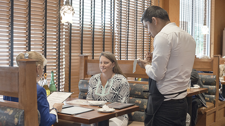
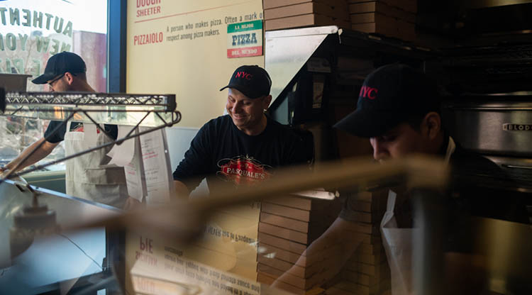
The colors, fonts, images, and location of items on the menu can all affect how your customers order. Also known as “menu engineering” the design of your menu makes all the difference in what will sell better to provide you with more profits.
Diners scan menus fairly quickly, spending only about 109 seconds, according to a recent Gallup poll. This means that you don’t have much time to influence what gets ordered. By using section headings, easy-to-find dish names, and other visual cues you will make it easier for your customers to scan the menu. When scanning menus arranged from top to bottom, your customers will spend more time looking at the first and last items, so the dishes in those locations are usually the biggest sellers. Additionally, most research indicates that when reading a menu, the upper right-hand corner tends to be viewed first. This is a great spot to put a higher profit item that you would like to sell more of.
Photos, illustrations, borders, boxes – anything that draws your eye toward a certain location on the menu – help to emphasize more profitable items. Be sure to use attention-getters sparingly, as the more often you do it, the less impact it will have.
Color can also be used to emphasize parts of the menu since people react to various colors in different ways. Research indicates that red and blue make people hungry, but if those colors don’t match your brand identity, using them may distract from your overall message.
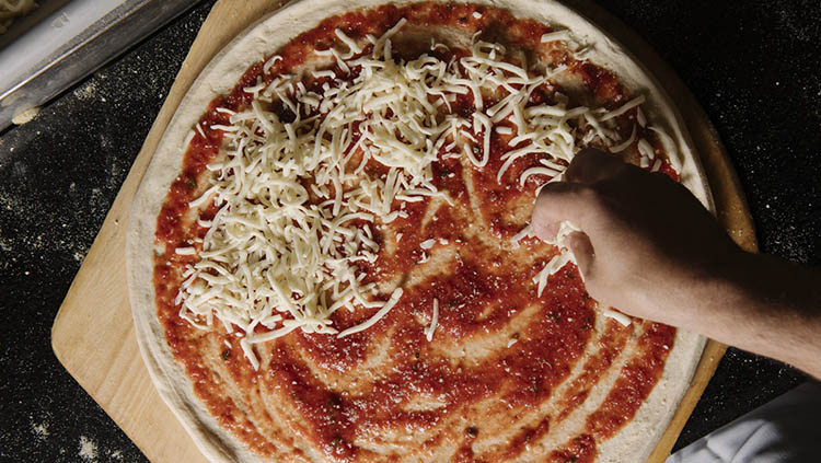
Use photos wisely – one image for every dish will clutter the menu. Studies show that using one image per page can increase sales for the featured menu item by up to 30%. Some restaurants use illustrations to highlight menu items. Whether you decide to use photos or illustration depends on your overall brand look and feel.
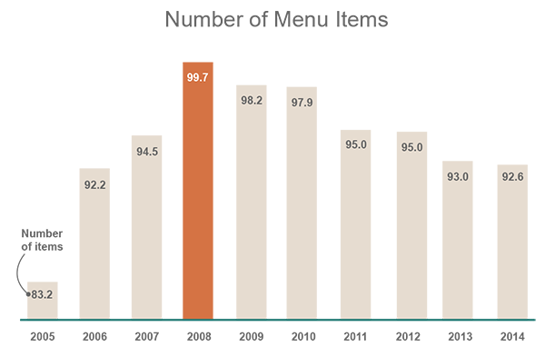
Menu length and the number of items offered on your menu should not be overwhelming to your customers. The average U.S. menu size is the smallest it’s been in 8 years, according to Datassential. Fewer menu items means more ingredient turnover, fresher supplies and less training for your staff.
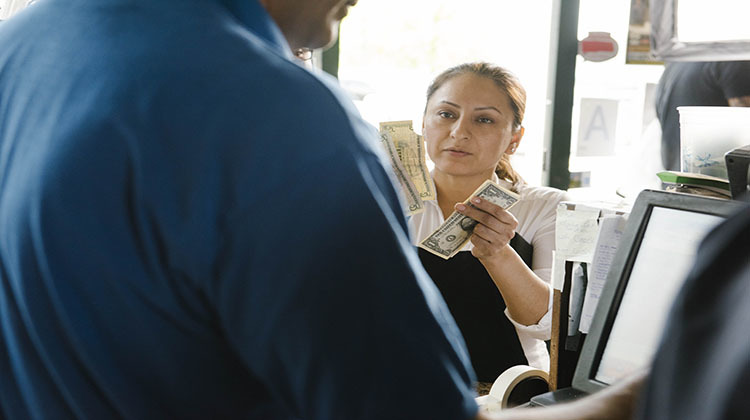
Don’t use dollar signs, it only reminds your guests that they are there to spend money. If you remove the dollar signs it eases the perception of higher prices for a consumer. In fact, people will spend more at restaurants where dollar signs or the word “dollars” isn’t used next to menu items, according to research conducted by The Center for Hospitality Research.1
Avoid listing prices in a column down the right side of the menu. This leads your customers to focus on the price rather than your food, which may influence them to order the cheapest item on the menu. Instead put the prices below menu item descriptions putting the emphasis back on your food.1
Grande provides menu design services that take into consideration the elements discussed in this article. Contact our Solutions @ Work team to discuss creating a menu.
All
We are excited to share the updated Grande Cheese App! Read the blog to learn more about what's been added.
Improve Profitability
Did you know when you commit to using 100% Grande cheeses on your pizza, you receive access to multiple business building solutions? Learn more about our 100-Percenter program and how it, along with the finest Italian cheese money can buy, can help you differentiate your restaurant from the competition.
Improve Profitability
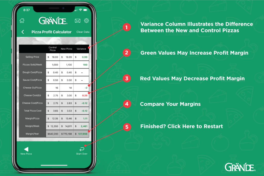
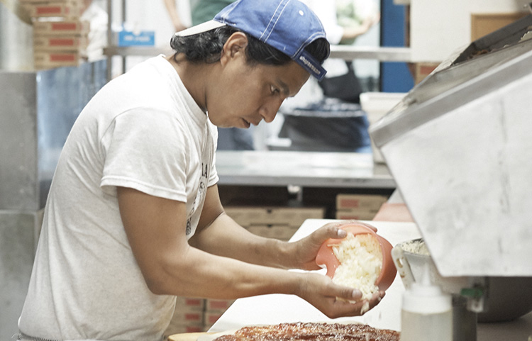
You've built your business on your commitment to using high quality ingredients, and your customers can taste the difference. While certain ingredients require your time and attention, the cheese that you use on your signature pie or sandwich doesn't have to be one of them! Use our conversion calculator to uncover your hidden costs shredding or slicing on your own.
Improve Profitability
Your menu is a key component of your overall marketing plan. By offering popular and appropriately priced items, you can increase sales. With rising food costs and labor challenges, now is the time to ensure your menu is optimally designed and priced profitably with these tools.
Our Cheese
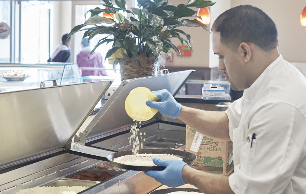
Is managing labor costs a challenge in your pizzeria? Learn how Grande's shredded, diced and sliced products can help you create back-of-house efficiencies while creating a consistent dining experience for your customers.
Improve Profitability
Looking for ideas to generate sales in your pizzeria this holiday season? Read on for top tips to keep your pizzeria profitable.
Improve Profitability
Did you know that it costs three times as much to attract a new customer to your restaurant than it does to keep an existing customer? There is an easy and simple way to understand what your customers think and want.
Improve Profitability
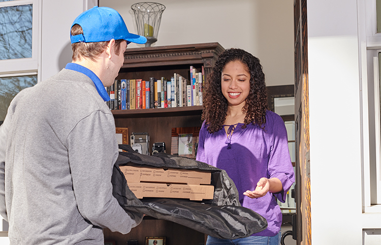
The case for adding delivery services for your restaurant is strong. When it comes to considering third party delivery, it is important to balance the pros and cons to your brand and your bottom line.
Improve Profitability
As profit margins shrink, the importance of portion control is even greater. Note that all of the major pizza chains consistently use portion control.
Improve Profitability
Consistency is critical when you’re building your business. Customers expect it. They want to know that every time they come to your restaurant, they will enjoy the same quality service, the same great-tasting food and the same memorable experience.